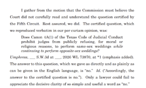
The Chief Justice’s recent concurrence in the denial of rehearing in Umphress v. Steel (a certified question from the Fifth Circuit about judicial conduct) emphasized the elegance of the word “no”:
Category Archives: Legal Writing
I recently published a short comment on the new Texas Rule of Appellate Procedure requiring a substantive introduction to petitions for review, in which I question the value of introductions in a time when generative AI can review and summarize the most complex of briefs in a few seconds.
 The Washington Post offers this lighthearted but substantive quiz to help you identify your perfect font. Give it a try!
The flight of the Democratic delegation from the Texas House has drawn a great deal of attention. The resulting legal filings in the Texas Supreme Court (Ken Paxton’s here, and these are the petition, response, and reply from the action filed by the Governor) display quality legal writing and excellent font choice. The Governor has chosen a classic look with a Century font, while the Texas Solicitor General uses Equity–generally speaking, a superior font, but perhaps not with the identical margins and spacing that one would use with Century (click here for a side-by-side comparison, which for some reason appears on 600Camp but comes out blurry on this site.)
 An unfortunate event involving citation to “hallucinated” case authority ended with this sanctions order. Three lessons can be learned:
- Avoid using Gen AI to do serious case research. There’s nothing wrong with asking it research questions to get ideas, and that can be quite helpful as part of an overall use of Gen AI to help write — so long as you remember that every citation it returns has to be checked for accuracy. Gen AI programs can look like databases, and they can act like databases, but Gen AI programs are not databases.
- If it’s too good to be true, it is. The problem in this case arose from a hallucinated Texas Supreme Court case from the late 19th Century that involved materially similar facts. If that was a Westlaw search result, it would require double-checking because it’s just so unlikely. The best “tell” that Gen AI is hallucinating is that it’s giving you exactly what you want to hear.
- Don’t lie behind the log. I don’t know all the facts of this case, but the order says that the appellant’s counsel did not take prompt action when the problem with the hallucinated citations was first brought to light. If something has been cited in error, get out in front of the error before your opponent and the court has to spend needless time and energy helping rectify it.
 A recent order from the Fifth Court that a party provide copies of several un-findable opinions suggests that, yet again, someone misused generative AI technology and relied on “hallucinated” case law.
The Texas Supreme Court recently gave final approval to several changes in the Rules of Appellate Procedure, all of which require the (helpful!) step of bookmarking the various components of an appellate submission.
A recent need for maintenance on my F-150 pickup caused me to read through the manual, which led me to appreciate how well-organized and readable it was. So I wrote “Why You Should Write Briefs Like Car Manuals” for the Bar Association of the Fifth Federal Circuit (available along with many other practical short articles in the “for members” section of its website). I hope you enjoy it and find the article of some use in your practice!
Judge Easterbrook’s recent opinion about good fonts for legal writing emphasized the importance of “x-height,” which is the relative size of a small “x” to a capital letter in a particular font. It’s important to note, though, that x-height is only one of the relevant size measures, and an excessively high x-height can cause problems with “descending” letters such as “p” and “y.” This excellent article, from which the below illustration is taken, further explains this point while defining the other relevant measurements.
Legendary Seventh Circuit judge Frank Easterbrook has written authoritatively on many topics. Thanks to AsymaDesign, LLC v. CBL & Assocs. Mgmnt, Inc., the choice of a good font is now among them.
Judge Easterbrook noted that he was writing in Palatino Linotype, the standard font of the Seventh Circuit (and one of two that I regularly use, alternating with Book Antigua). He explained that it’s a desirable font for legal writing because it has a large “x-height” (the height of a lowercase “x” compared to a capital letter), along with similar fonts designed for book publication:
 The Appellant made the unfortunate choice of Bernhard Modern, a “display face suited to movie posters and used in the title sequence of the Twilight Zone TV show.” Because of that font’s low x-height, it’s hard to read in book-like writing:
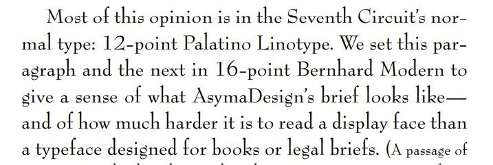 He concluded: “We hope that Bernhard Modern has made its last appearance in an appellate brief. “
This is a cross-post from 600 Camp:
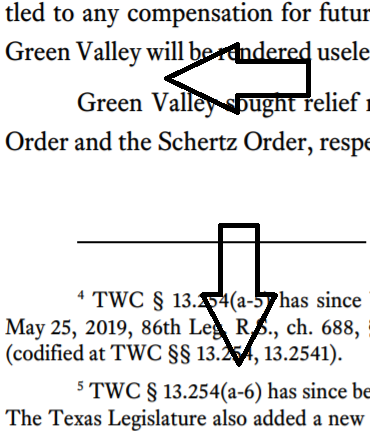
Thryv, Inc. v. NLRB, a review of the NLRB’s handling of an unfair labor practices case, presents deft usage of a typographical device called the “dinkus”:
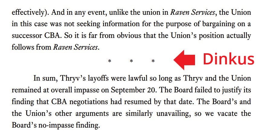
Thanks to the observant Cedric Bond for pointing this out!
This Instagram video with fonts talking to each other is really funny. Thanks to my law partner Mary Nix for sending it my way.
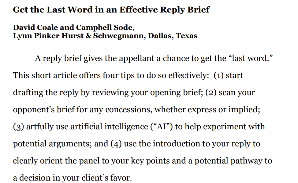
Start the New Year out right with “Get the Last Word in an Effective Reply Brief,” which I recently co-wrote for the Bar Association of the Fifth Federal Circuit with my skillful colleague Campbell Sode – available here along with many other valuable practice pointers by members of that great bar association.
 The Bar Association of the Fifth Federal Circuit is the bar association to belong to if you’re interested in the work of the U.S. Court of Appeals for the Fifth Circuit. More information about member benefits is detailed on the BAFFC’s website. One of those benefits is a terrific set of short (c. 500 word) articles about appellate practice (here’s an example that I did about a year ago on oral-argument preparation).
Please consider writing one yourself! A link will be emailed out several times to the BAFFC’s thousands of members, as part of its daily updates about recent decisions, and it’ll be available to the membership online as part of the full collection of these pieces. Contact BAFFC administrator Mary Douglas at mary@baffc.org!
An antitrust case in Tennessee recently produced a remarkably contentious dispute about the definition of “double spacing,” as deftly summarized in this “Above the Law” article titled “Heated Litigation Fight Over Double Spacing Ends in Judge Telling Everyone to Shut Up.” While the dispute was picayune, the discussion of just what exactly “double spacing” means is interesting background for a modern word-processing feature that we seldom stop and think about. Thanks to my law partner Chris Schwegmann for flagging this for me.
Thanks to a persuasive letter from a typographically sophisticated attorney, the Maryland Supreme Court recently recently modernized its list of acceptable fonts, as follows (omitting Palatino and Equity, however). Thanks to my law partner Greg Brassfield for drawing this to my attention!
 Also of general interest, the letter links to an informative series of Tweets about the typography used in the federal courts of appeal.
Boyer v. Mode Transp., LLC, decided by the Fifth Court last week, provides a useful “update” of special-appearance law after some recent Texas and U.S. Supreme Court opinions, and I’ll have a post about it later in the week. A footnote involves an important practical issue in preparing a case for appeal:
The public clerk’s record will contain redacted versions of anything that was filed under seal, pursuant to a protective order, etc. Counsel has to identify such materials before briefing starts and find a way to get that material to the court of appeals before briefing begins. That often requires some coordination with the staff of both the relevant trial and appeals court.
In last week’s Texas Lawbook, I reported on an experiment with an AI competitor of ChatGPT called Claude. It’s not ready to be a virtual law clerk yet, but its surprisingly powerful.
The Onion, America’s Finest News Source, recently weighed in at SCOTUS with a brilliant amicus brief about First Amendment protection for parody; this excerpt summarizes the overall flavor:
With respect to court orders and judgments, the words “signed,” “rendered,” and “entered” are often used interchangeably. But those words have specific, technical meanings, and it is wise to remember those meanings when differences matter. Accord, Burrell v. Cornelius, 570 S.W.2d 382, 384 (Tex. 1978) (“Judges render judgment; clerks enter them on the minutes. … The entry of a judgment is the clerk’s record in the minutes of the court. ‘Entered’ is synonymous with neither ‘Signed’ nor ‘Rendered.’”).
Two rules set the background as to when critical countdowns commence:
- Tex. R. Civ. P. 306a: “The date of judgment or order is signed as shown of record shall determine the beginning of the periods prescribed by these rules for the court’s plenary power to grant a new trial or to vacate, modify, correct or reform a judgment or order and for filing in the trial court the various documents that these rules authorize a party to file …”
- Similarly, Tex. R. App. P. 26.1 begins: “The notice of appeal must be filed within 30 days after the judgment is signed, except as follows …”
By contrast, “[j]udgment is rendered when the trial court officially announces its decision in open court or by written memorandum filed with the clerk.” E.g., S&A Restaurant Corp. v. Leal, 892 S.W.2d 855, 857 (Tex. 1995) (per curiam). And the above-quoted paragraph from Rule 306a concludes: “… but this rule shall not determine what constitutes rendition of a judgment or order for any other purpose.”
By contrast, entry of judgment refers to the recording of a rendered judgment in the court’s official records. See, e.g., Lone Star Cement Corp v. Fair, 467 S.W.2d 402, 405 (Tex. 1971) (“The law is settled in this state that clerical errors in the entry of a judgment, previously rendered, may be corrected after the end of the court’s term by a nunc pro tunc judgment; however, judicial errors in the previously rendered judgment may not be so corrected.” (emphasis added)).
I gratefully acknowledge the excellent insights of Ben Taylor in preparing this post!
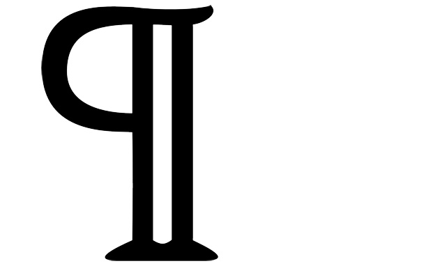 If the details of the virgule are not obscure enough for you, then you will love this wonderful article from Smithsonian Magazine about the “pilcrow,” a/k/a the paragraph symbol.
 The London Underground reminds its riders to “Mind the Gap” so they do not trip when entering or exiting a train. The Fifth Circuit’s new typography places a notable gap between paragraphs and footnotes. While this sort of line-spacing does not have a technical label like “kerning,” it is nevertheless an important part of the overall look and feel of a piece of legal writing. What are your thoughts on inter-paragraph line spacing?
When not engaged in good-natured banter about typeface or proper spacing after periods, the appellate community often argues about the right place to put citations to authority. The traditional approach places them “inline,” along with the text of the legal argument. A contrarian viewpoint, primarily advanced by Bryan Garner, argues that citations should be placed in footnotes.
Has modern technology provided a third path? Professor Rory Ryan of Baylor Law School advocates “fadecites,” reasoning:
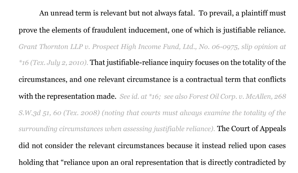
A brief using this approach would look like this on a first read:
(A longer example is available on Professor Ryan’s Google Drive.) The reader can quickly skim over citations while reviewing the legal argument. Additionally, assuming that the court’s technology allows it, case citations can be arranged to become more visible if the reader wants to know more information. Modern .pdf technology allows a citation to become darker and more visible if the reader places the cursor on it. A hyperlink to the cited authority could also be made available.
This idea offers an ingenious solution to a recurring challenge in writing good, accessible briefs. I’d be interested in your thoughts and Professor Ryan would be as well.
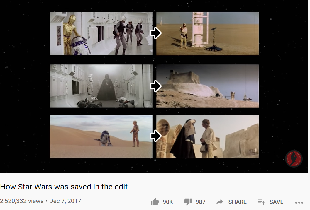 With the kids home from school because of the coronavirus, I’ve watched a lot of YouTube videos over their shoulders. In particular, this one tells the fascinating story about how post-production editing saved Star Wars, which was bloated and impossible to follow in its first rough versions. Among
  other changes, the start of the film was drastically simplified – from a series of back-and-forths between space and Tatooine, to a focus on the opening space battle and no shots of Tatooine until the droids landed there. This bit of editing is directly relevant to the tendency of legal writers to “define” (introduce) all characters and terms at the beginning of their work, without regard to the flow of the narrative that follows.
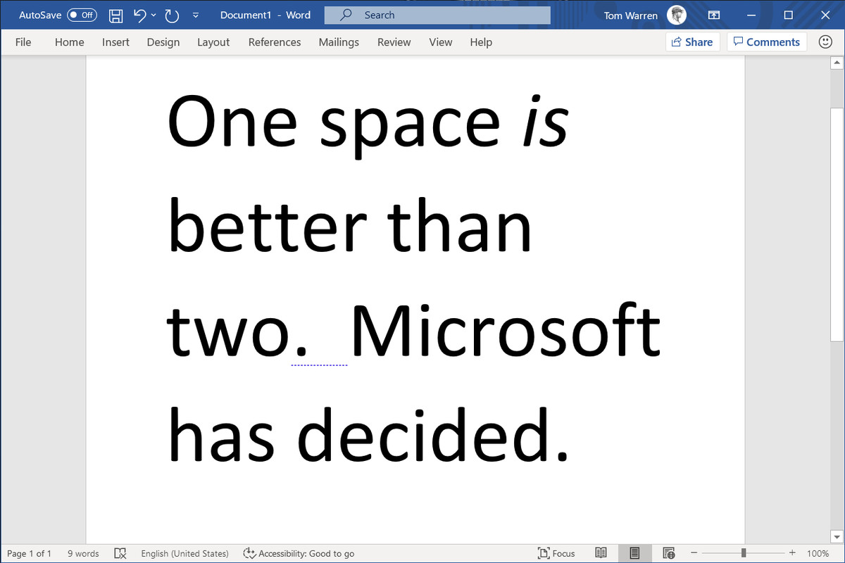 As reported by The Verge on April 24, Microsoft Word now auto-corrects the use of two spaces after a period at the end of a sentence. The battle, such as it was, should now be considered over. This influential article in Slate explains why the one-spacers – while correct during the era of typewriters, which made every letter and space the same size – have been wrong since the early 1990s and the widespread availability of proportional spacing in modern word processing software.
